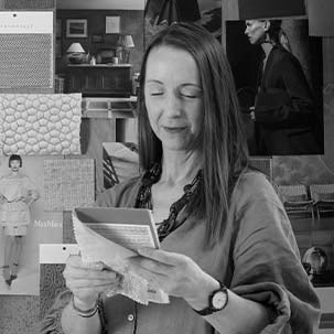
At Silver Cross, designing luxury baby pram fabrics is where craftsmanship meets contemporary lifestyle. Each fabric begins with a spark of inspiration, drawn from global fashion trends, interior design influences, and the evolving needs of modern parents.
Silver Cross Fabric Design Manager Helen Smith explains how colour psychology, trend forecasting and meticulous craftsmanship shape the next generation of luxury baby products.
How do fashion and lifestyle trends influence the colours parents gravitate towards today?
Global lifestyle trends steer our subconscious decision-making daily. Colours, shapes, details, visual cues all play a part in our sense of belonging - to a style or to a community that we feel part of.
Our surroundings become sensory – seeing, touching, embracing things every day that we then look for in all we buy and like. We start to love certain looks, ideas, brands, objects and resonate towards them.
How do you predict colour trends in the baby pram space?
Through research, exploration and experience, and then translating this data to create our in-house direction. This ensures each collection aligns with emerging parenting trends while maintaining timeless appeal.
Do baby product colour trends differ from fashion?
While fashion trends inform the design process, baby products follow a unique trajectory. Parents prioritise safety and trust, longevity and durability, emotional connection, practicality and versatility.
A pram is not just a fashion item. It’s an extension of a family’s lifestyle. The colour palette must feel relevant but also reassuring and enduring.
Do you find inspiration from travel, art and architecture?
Modern design inspiration is increasingly global. Travel, art, and architecture all feed into the creative process. We’re constantly influenced by the world around us. From city architecture to cultural design movements, these ideas shape our materials, styling and colour direction.
Recent influences have included 1970s-inspired tones, minimalist Japanese design aesthetics and European city palettes, such as Parisian neutrals. These elements are carefully refined to suit a global audience while maintaining long-term relevance in luxury baby design.
How does colour psychology play a part in in baby product design?
Colours can massively affect our purchasing decisions. Pure colour psychology sees consumers associate a colour with something they love or they don’t.
Colour is incredibly subjective. For some, it represents belonging and luxury, while for others it’s a form of self-expression Certain shades evoke emotional responses:
- Neutral tones for calm, stability, reassurance
- Soft earthy palettes for warmth, grounding
- Bold colours for individuality and energy
By offering versatile palettes, Silver Cross allows parents to personalise their pram choice while still aligning with premium design aesthetics
What inspired the rise of neutral baby pram colours?
One of the most significant trends in recent years is the dominance of elevated neutral tones in baby prams and nursery products - warm beiges, soft greys, stone hues and muted taupes.
Neutrals are popular because they create a calming environment for both parent and baby, plus they’re gender-neutral, offering inclusivity and longevity. They also allow easy personalisation through accessories while aligning with modern interior design trends
This global shift towards neutral palettes reflects a desire for certainty, calm, and balance.
How do refined neutrals support a sense of wellbeing and balance in family spaces?
Today’s parents are increasingly mindful of how design impacts wellbeing. Refined, neutral colour palettes help to create serene family environments while supporting a sense of order and harmony. They provide a timeless foundation for evolving lifestyles
Neutral tones also transition effortlessly across different stages of parenting, making them a practical yet luxurious choice.